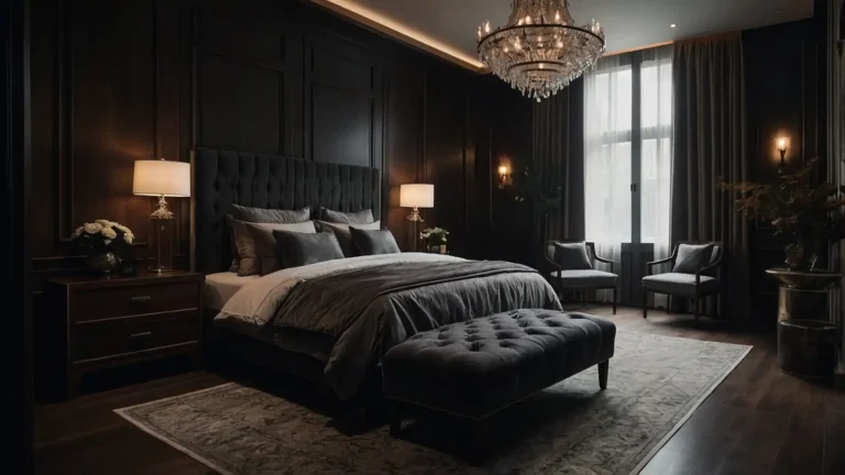

27 Paint Colors For Cherry Wood Furniture
Cherry wood furniture deserves paint colors that enhance its natural warmth and rich character.
The right wall color transforms cherry’s distinctive reddish tones into stunning focal points.
These carefully selected colors complement cherry wood’s unique grain patterns and lustrous finish.
You’ll discover shades that either harmonize with or beautifully contrast cherry’s warm undertones.
Smart color choices prevent overwhelming cherry’s natural beauty while creating cohesive room designs.
Whether your cherry pieces are light or deeply aged, these colors enhance their inherent elegance.
1: Warm Cream

Warm cream creates the perfect neutral backdrop that allows cherry wood’s natural beauty to shine.
You’ll love how this gentle hue enhances cherry’s reddish undertones without competing for attention.
Your dining sets, bedroom suites, and office furniture gain prominence against cream walls.
The subtle yellow undertones complement cherry’s warmth while maintaining bright, welcoming atmospheres.
This versatile color works beautifully in any room with cherry furniture pieces. You’ll achieve timeless elegance that never goes out of style.
2: Sage Green

Sage green provides stunning contrast that makes cherry wood appear richer and more vibrant.
You’ll appreciate how this muted green creates sophisticated color combinations that feel naturally harmonious.
This earthy shade works especially well in dining rooms and living spaces. Your cherry furniture pieces become striking focal points against sage’s calming backdrop.
The gray-green undertones prevent overwhelming while adding subtle personality. You’ll create spaces that feel both elegant and refreshingly organic.
3: Soft Gold

Soft gold enhances cherry wood’s natural warmth while adding luxurious sophistication to any space.
You’ll love how this rich neutral creates cohesive color schemes that feel expensive. This elegant choice works beautifully with both light and dark cherry finishes.
Your furniture gains enhanced richness while maintaining the room’s overall brightness and appeal.
The golden undertones complement cherry’s reddish hues perfectly without clashing.
You’ll achieve harmonious design that feels both comfortable and impressively upscale.
4: Deep Navy

Deep navy creates dramatic contrast that makes cherry wood furniture appear lighter and more striking.
You’ll appreciate how this bold choice adds sophistication and contemporary appeal.
This classic color works especially well in traditional and transitional room designs.
Your cherry pieces pop against navy’s rich backdrop while maintaining elegant, timeless aesthetics.
The cool undertones balance cherry’s warmth for perfect visual equilibrium. You’ll achieve professional-quality results that feel both bold and beautifully balanced.
5: Mushroom Gray

Mushroom gray offers sophisticated neutrality that enhances cherry wood’s natural character without overwhelming.
You’ll love how this warm gray creates calming, elegant atmospheres. This versatile shade complements both formal and casual cherry furniture pieces.
Your dining tables, cabinets, and bedroom sets gain prominence while maintaining cohesive room design.
The beige undertones prevent coldness while highlighting cherry’s rich grain patterns. You’ll create spaces that feel both contemporary and timelessly appealing.
6: Antique White

Antique white provides classic elegance that showcases cherry furniture’s craftsmanship and grain detail.
You’ll appreciate how this refined neutral creates bright, welcoming spaces. This timeless choice works beautifully in kitchens, dining rooms, and bedrooms alike.
Your cherry cabinets and furniture pieces gain enhanced visibility and sophisticated appeal.
The cream undertones add warmth while maintaining essential brightness and airiness.
You’ll achieve traditional beauty that complements cherry’s inherent classic appeal.
7: Forest Green

Forest green creates rich, dramatic backdrops that make cherry wood appear more luxurious.
You’ll love how this deep color adds personality while enhancing furniture’s natural warmth.
This sophisticated shade works especially well in libraries, studies, and formal dining areas.
Your cherry pieces become stunning focal points against forest’s elegant backdrop. You’ll achieve bold elegance that feels both striking and naturally balanced.
The deep green undertones complement cherry’s reddish hues for harmonious contrast.
8: Buttercream

Buttercream brings gentle warmth that harmonizes beautifully with cherry wood’s natural golden undertones.
You’ll create cozy, inviting spaces that feel both bright and welcoming. This cheerful color works wonderfully in kitchens and breakfast areas especially.
Your cherry cabinets and furniture coordinate perfectly with buttercream’s sunny disposition.
The pale yellow undertones enhance cherry’s warmth without overwhelming smaller spaces.
You’ll achieve comfortable elegance that feels both sophisticated and homey.
9: Dusty Blue

Dusty blue offers calming contrast that makes cherry furniture appear more vibrant and striking.
You’ll appreciate how this gentle color creates sophisticated, peaceful atmospheres.
This versatile shade works beautifully in bedrooms and casual living spaces.
Your cherry pieces gain enhanced prominence while maintaining relaxing, comfortable room environments.
The gray undertones prevent overwhelming while adding subtle personality and charm. You’ll create spaces that feel both elegant and refreshingly tranquil.
10: Taupe

Taupe provides warm neutrality that complements cherry wood’s rich tones without competing for attention.
You’ll love how this sophisticated color creates elegant, cohesive room designs.
This classic choice works with both traditional and contemporary cherry furniture styles.
Your pieces gain enhanced beauty while maintaining the room’s overall balance and sophistication.
The brown-gray undertones highlight cherry’s natural grain while preventing visual conflicts.
You’ll achieve professional results that feel both polished and comfortably livable.
11: Ivory

Ivory creates bright, elegant backdrops that showcase cherry furniture’s craftsmanship and natural beauty.
You’ll appreciate how this refined neutral enhances wood grain visibility. This timeless color works especially well in formal dining and living areas.
Your cherry pieces become stunning centerpieces while maintaining sophisticated, classic room aesthetics.
The cream undertones add subtle warmth while maximizing light reflection. You’ll create spaces that feel both luxurious and bright throughout the day.
12: Pewter

Pewter offers contemporary sophistication that makes cherry wood appear more vibrant and modern.
You’ll love how this cool gray creates striking contrasts with warm wood tones. This versatile shade works beautifully in modern and transitional room designs.
Your cherry furniture gains enhanced prominence while maintaining sleek, updated room aesthetics.
The metallic undertones add subtle glamour while highlighting cherry’s natural richness.
You’ll achieve balanced elegance that feels both current and timelessly appealing.
13: Warm Beige

Warm beige creates harmonious color schemes that enhance cherry wood’s natural warmth and character.
You’ll appreciate how this neutral promotes comfortable, welcoming room atmospheres.
This classic choice complements both formal and casual cherry furniture pieces perfectly.
Your dining sets and bedroom suites coordinate beautifully with beige’s earthy undertones.
The brown undertones highlight cherry’s richness while maintaining bright, airy feelings. You’ll create spaces that feel both elegant and comfortably inviting.
14: Soft Lavender

Soft lavender provides gentle contrast that makes cherry furniture appear warmer and more striking.
You’ll love how this romantic color adds personality without overwhelming spaces. This delicate shade works especially well in bedrooms and powder rooms.
Your cherry pieces gain enhanced beauty while maintaining feminine, elegant room atmospheres.
The purple undertones create sophisticated contrast while preventing harsh color clashes.
You’ll achieve unique elegance that feels both bold and beautifully harmonious.
15: Oyster

Oyster brings sophisticated neutrality with subtle gray undertones that complement cherry wood beautifully.
You’ll appreciate how this refined color creates elegant, timeless room designs. This versatile choice works with any cherry furniture style or room type.
Your pieces gain enhanced prominence while maintaining sophisticated, cohesive overall aesthetics.
The beige-gray blend prevents overwhelming while adding subtle depth and character. You’ll create spaces that feel both polished and comfortably welcoming.
16: Celery

Celery offers fresh, organic contrast that makes cherry wood appear richer and more vibrant.
You’ll love how this pale green creates sophisticated, nature-inspired atmospheres. This contemporary color works beautifully in kitchens and casual dining areas.
Your cherry cabinets and furniture coordinate perfectly with celery’s fresh, clean undertones.
The yellow-green blend complements cherry’s warmth while adding refreshing personality.
You’ll achieve elegant contrast that feels both striking and naturally harmonious.
17: Stone Gray

Stone gray provides contemporary neutrality that showcases cherry furniture’s natural grain and character.
You’ll appreciate how this sophisticated color creates calming, elegant atmospheres.
This versatile shade works with both modern and traditional cherry pieces.
Your furniture gains enhanced visibility while maintaining sleek, updated room aesthetics throughout.
The cool undertones balance cherry’s warmth for perfect visual equilibrium. You’ll create spaces that feel both contemporary and timelessly sophisticated.
18: Vanilla

Vanilla creates warm, inviting backdrops that enhance cherry wood’s natural golden undertones beautifully.
You’ll love how this gentle neutral promotes comfortable, welcoming environments.
Your cherry furniture coordinates perfectly with vanilla’s cozy, approachable character.
The cream undertones add richness while maintaining bright, cheerful room atmospheres.
This classic color works especially well in family rooms and casual dining areas. You’ll achieve comfortable elegance that feels both sophisticated and homey.
19: Slate Blue

Slate blue offers dramatic contrast that makes cherry furniture appear more luxurious and striking.
You’ll appreciate how this sophisticated color adds personality while maintaining elegance.
This bold choice works beautifully in formal dining rooms and studies. Your cherry pieces become stunning focal points against slate’s rich, dramatic backdrop.
The gray undertones prevent overwhelming while creating sophisticated color combinations.
You’ll achieve bold elegance that feels both striking and professionally balanced.
20: Cream Silk

Cream silk brings luxurious sophistication that complements cherry wood’s natural richness and luster. You’ll love how this elegant neutral creates bright, upscale atmospheres.
This refined color works with any cherry furniture style or finish type. Your pieces gain enhanced beauty while maintaining sophisticated, cohesive room designs throughout.
The silk undertones add subtle glamour while highlighting wood’s natural grain patterns. You’ll create spaces that feel both luxurious and elegantly welcoming.
21: Sage Mist

Sage mist provides gentle contrast that makes cherry furniture appear warmer and more vibrant. You’ll appreciate how this soft green creates sophisticated, calming environments.
This versatile shade works especially well in bedrooms and living areas. Your cherry pieces coordinate beautifully with sage’s peaceful, organic undertones and character.
The blue-green blend complements cherry’s warmth while adding refreshing personality.
You’ll achieve elegant harmony that feels both sophisticated and naturally balanced.
22: Champagne

Champagne offers metallic sophistication that enhances cherry wood’s natural luster and grain detail.
You’ll love how this elegant neutral creates luxurious, glamorous atmospheres. This upscale color works beautifully in formal dining and entertaining spaces.
Your cherry furniture gains enhanced richness while maintaining sophisticated, elegant room aesthetics.
The golden undertones complement cherry’s warmth while adding subtle shimmer effects. You’ll create spaces that feel both luxurious and timelessly elegant.
23: Dove Gray

Dove gray creates sophisticated neutrality that showcases cherry furniture’s natural beauty and craftsmanship.
You’ll appreciate how this gentle color promotes calming, elegant environments. This contemporary shade works with both traditional and modern cherry pieces.
Your furniture gains enhanced prominence while maintaining sleek, updated room aesthetics.
The blue undertones provide cooling contrast while highlighting cherry’s warm character.
You’ll achieve balanced elegance that feels both current and timelessly appealing.
24: Warm White

Warm white provides bright, clean backdrops that showcase cherry wood’s rich grain and natural character.
You’ll love how this classic neutral creates fresh, welcoming spaces. This timeless choice works with any cherry furniture style or room type.
Your pieces gain enhanced visibility while maintaining bright, airy room atmospheres throughout.
The cream undertones prevent starkness while maximizing light reflection and brightness. You’ll create spaces that feel both elegant and comfortably inviting.
25: Dusty Rose

Dusty rose offers romantic contrast that makes cherry furniture appear richer and more striking.
You’ll appreciate how this gentle color adds personality while maintaining sophistication.
Your cherry pieces coordinate beautifully with rose’s warm, romantic undertones and charm.
The gray undertones prevent overwhelming while creating sophisticated color harmonies.
This feminine shade works especially well in bedrooms and sitting areas. You’ll achieve unique elegance that feels both bold and beautifully balanced.
26: Linen

Linen brings textural sophistication that complements cherry wood’s natural grain and finish beautifully.
You’ll love how this neutral creates elegant, timeless room designs. This versatile color works with both formal and casual cherry furniture pieces.
Your dining sets and bedroom suites gain enhanced prominence while maintaining sophisticated aesthetics.
The beige undertones add warmth while preventing any feeling of coldness. You’ll create spaces that feel both polished and comfortably welcoming throughout.
27: Seafoam

Seafoam provides fresh, coastal contrast that makes cherry furniture appear warmer and more vibrant.
You’ll appreciate how this blue-green creates sophisticated, nature-inspired atmospheres.
This contemporary color works beautifully in casual living and dining areas.
Your cherry pieces become striking focal points while maintaining relaxed, comfortable room environments.
The aqua undertones complement cherry’s warmth while adding refreshing coastal personality.
You’ll achieve elegant contrast that feels both sophisticated and naturally harmonious.
Conclusion
Choose colors that either harmonize with or beautifully contrast cherry wood’s warm undertones.
The right paint enhances your furniture’s natural beauty magnificently.