
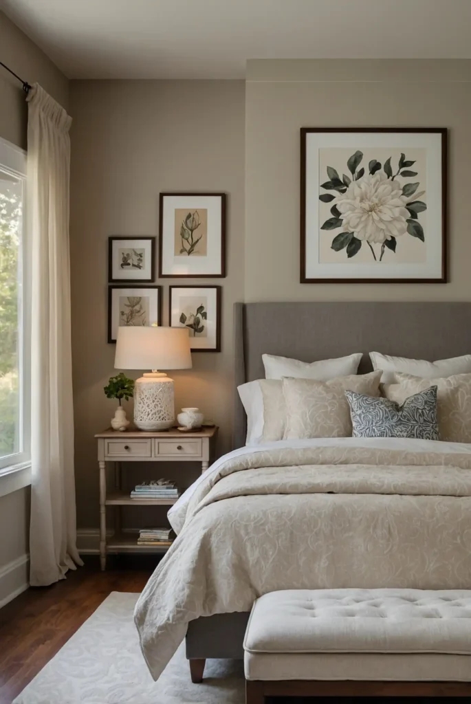
27 Best Paint Colors for Guest Bedroom
Your guest bedroom sets the tone for your visitors’ entire stay experience.
The right paint color creates a welcoming atmosphere that makes guests feel comfortable and appreciated.
You want colors that appeal to diverse tastes while promoting relaxation and restful sleep.
The perfect shade balances personality with universal appeal for maximum guest satisfaction.
These carefully selected colors ensure your guest room feels like a peaceful retreat that visitors will remember fondly long after their stay.
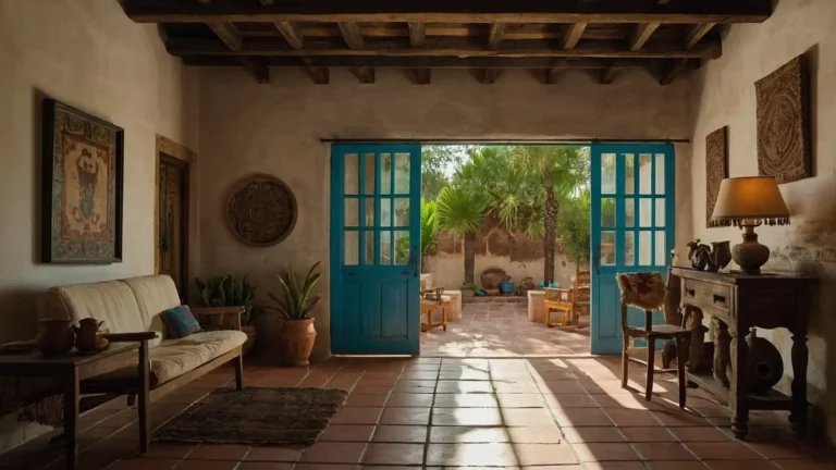
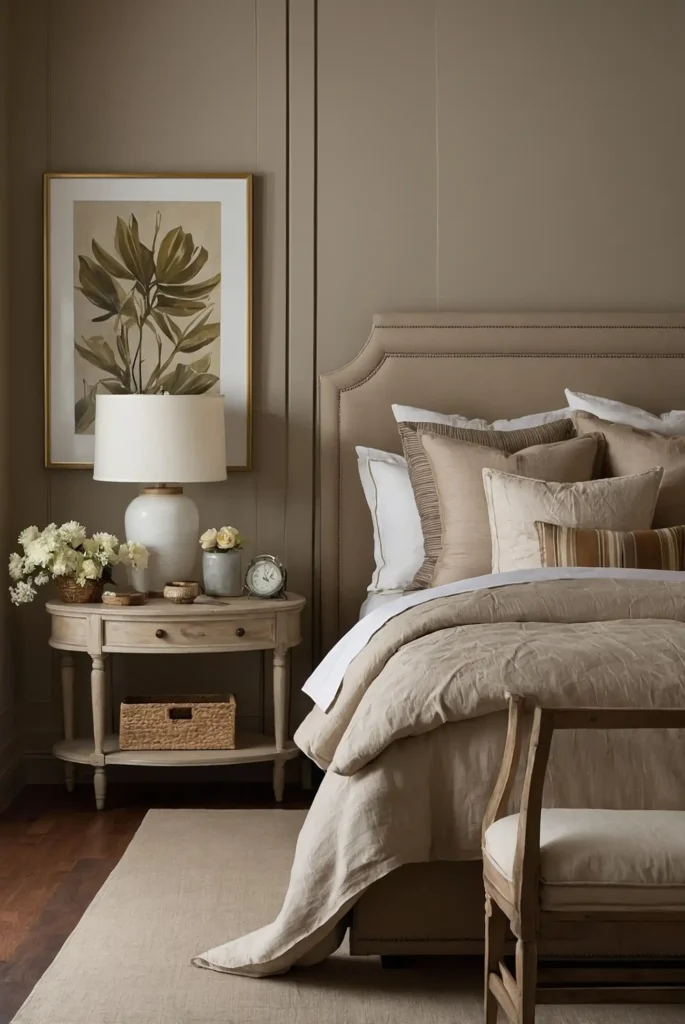
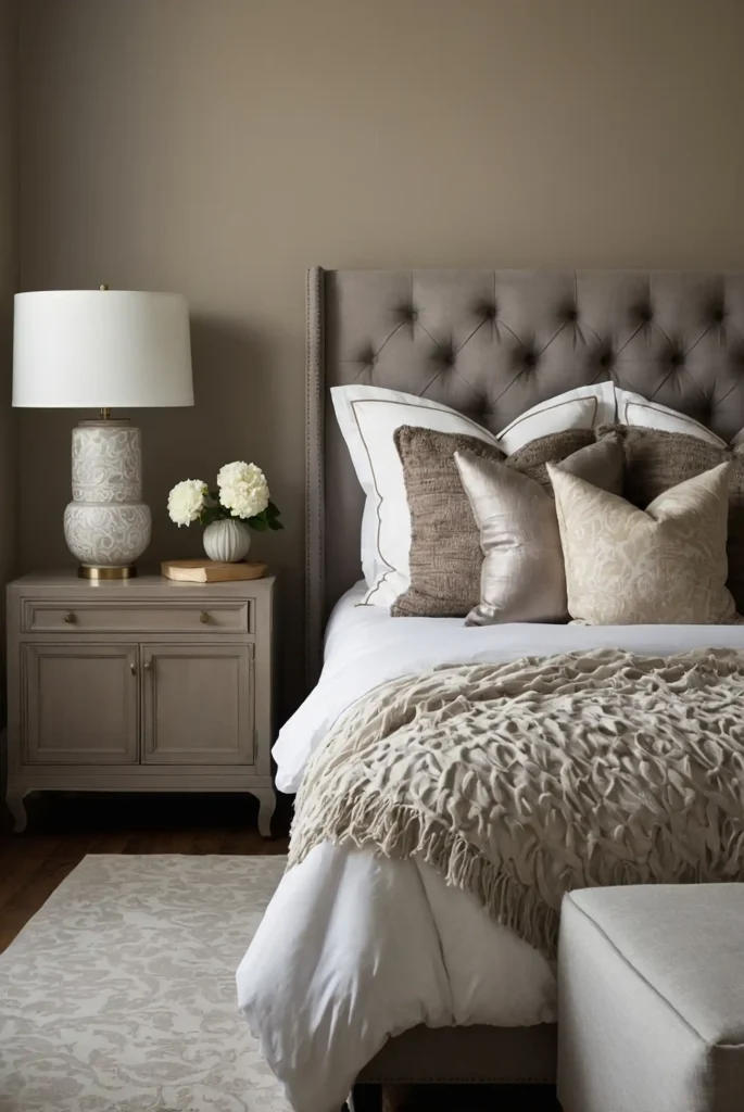
1: Soft Neutral Beige
You create instant warmth and hospitality with this universally appealing neutral that suits every guest’s preferences.
This timeless color provides a cozy backdrop that feels both sophisticated and welcoming.
Beige works beautifully with any bedding style or color scheme your guests might prefer. It creates a hotel-like elegance that makes visitors feel pampered and comfortable.
The versatile tone allows you to change seasonal décor easily while maintaining a consistently welcoming atmosphere for all guests.
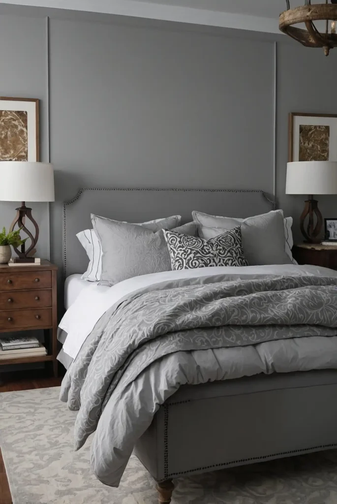
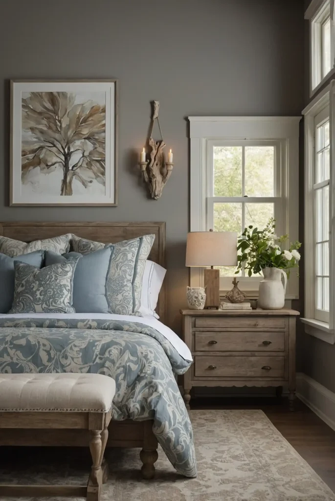
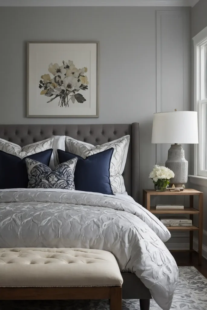
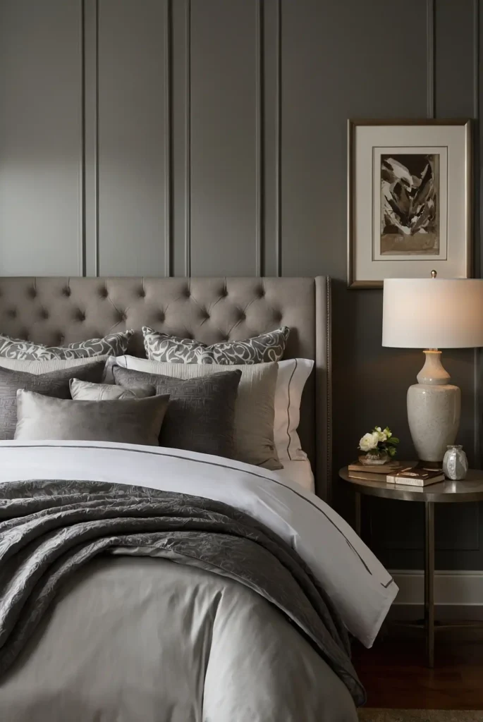
2: Classic Light Gray
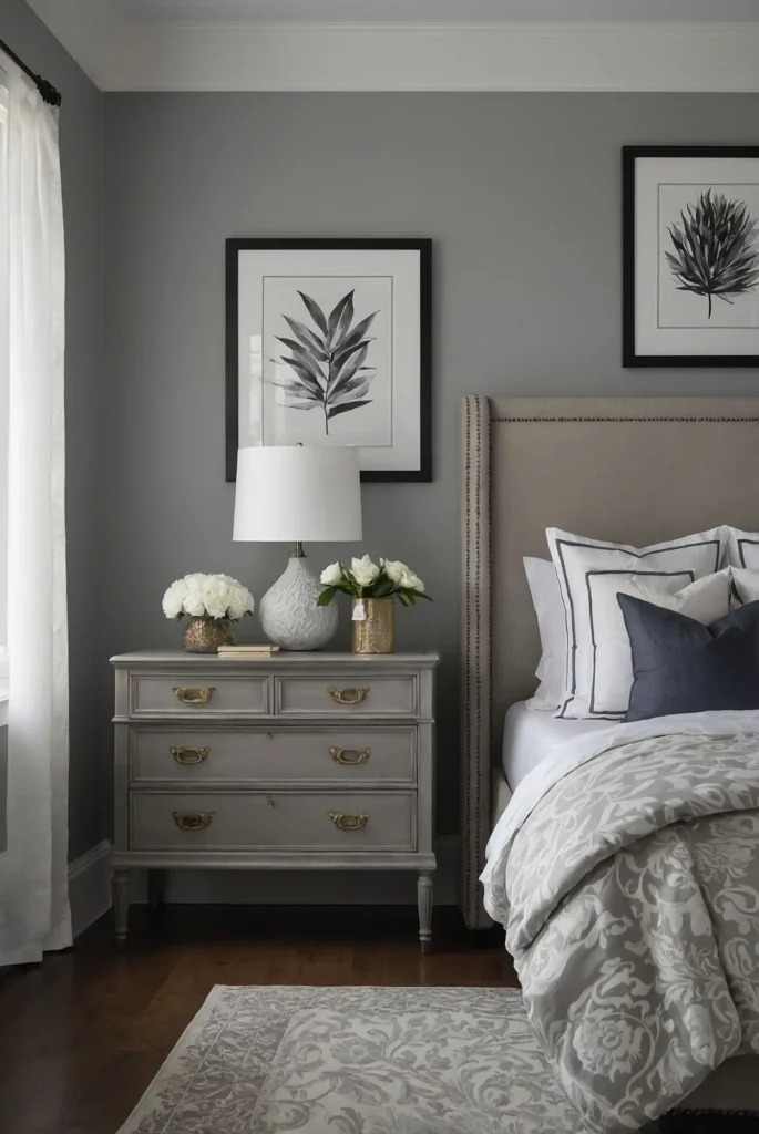
Light gray offers you modern sophistication that appeals to contemporary tastes while remaining timelessly elegant.
This neutral creates a calm, serene environment perfect for restful sleep. It feels fresh and clean without being sterile or unwelcoming.
You’ll appreciate how gray provides a perfect backdrop for colorful artwork and varied bedding choices.
The contemporary color works with both masculine and feminine décor preferences, ensuring all guests feel equally comfortable in the space.
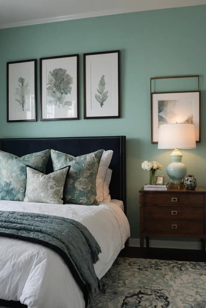
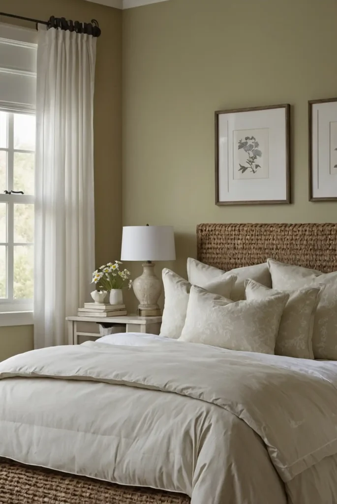
3: Gentle Sage Green

Sage green brings you nature-inspired tranquility that promotes relaxation and peaceful sleep for weary travelers.
This soft color creates a spa-like atmosphere that feels both refreshing and calming.
You’ll love how sage pairs beautifully with white linens and natural wood furniture pieces. It adds subtle personality without overwhelming guests with bold color choices.
The soothing tone helps guests unwind from travel stress while creating a connection to nature that enhances rest quality.
4: Warm Mushroom
Warm mushroom gives you earthy sophistication that feels both cozy and elegant for discerning guests.
This neutral blend creates depth while maintaining the calming atmosphere essential for rest.
You’ll find that mushroom complements both traditional and contemporary furnishing styles beautifully.
It provides warmth without being overwhelming or too personal in taste.
The sophisticated tone creates a boutique hotel feeling that makes guests feel special while ensuring universal appeal across different preferences.
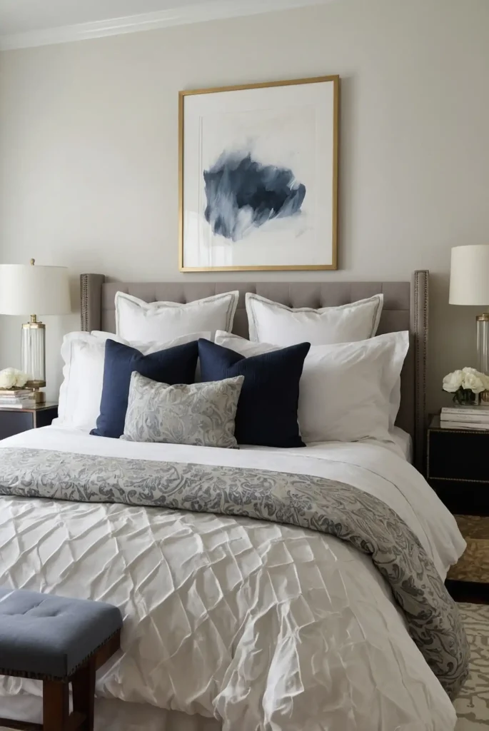
5: Soft Dove Gray
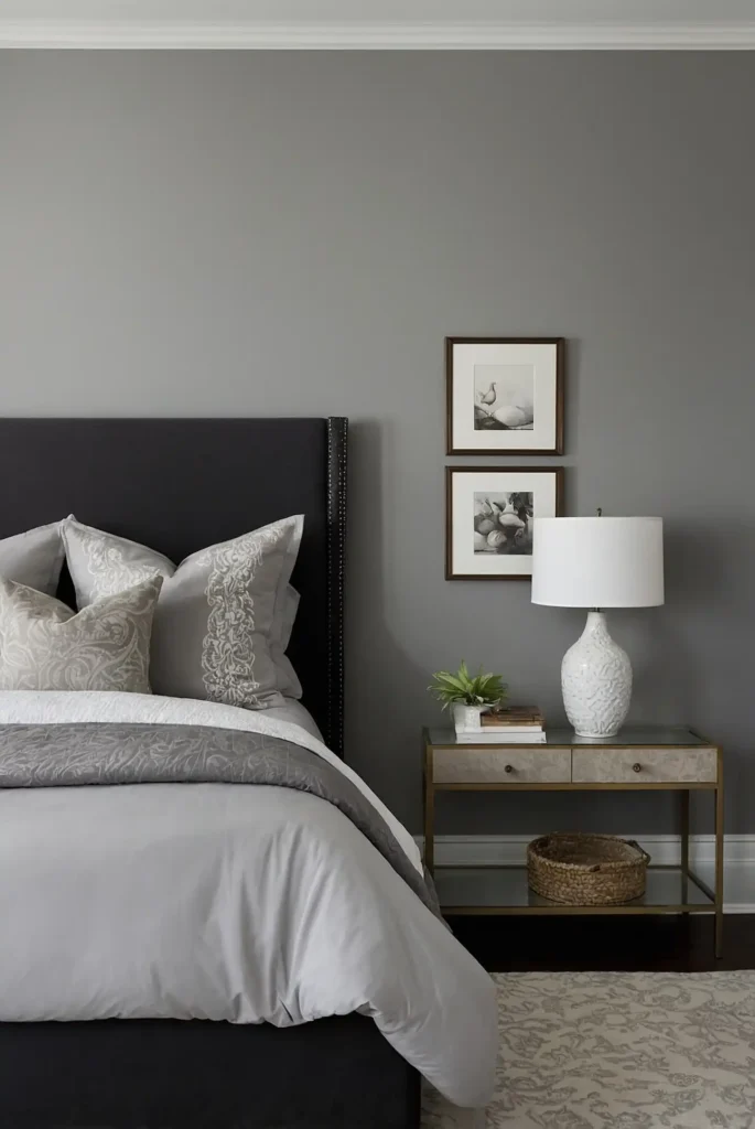
Dove gray provides you with gentle neutrality that feels both modern and timeless for versatile guest appeal.
This subtle color creates sophistication without sacrificing warmth or comfort. It feels fresh and contemporary while remaining universally flattering.
You’ll appreciate how dove gray works with any accent color and decorating style your guests might encounter.
The calming shade promotes restful sleep while providing an elegant backdrop that makes any guest feel welcomed and valued.
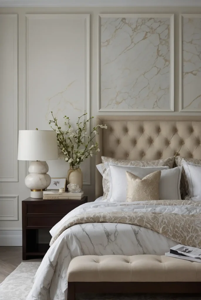
6: Creamy White
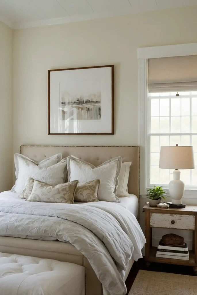
Creamy white offers you classic elegance with added warmth that prevents the space from feeling cold or impersonal.
This sophisticated neutral creates a luxurious hotel-like atmosphere.
You’ll love how cream brightens the room while maintaining coziness that makes guests feel at home. It provides a perfect canvas for seasonal decorating changes.
The timeless color ensures your guest room never goes out of style while appealing to visitors of all ages and preferences.
7: Pale Sea-foam
Pale sea-foam brings you coastal tranquility that creates a vacation-like retreat for visiting guests.
This gentle blue-green promotes relaxation while adding subtle personality to the space.
You’ll appreciate how sea-foam evokes peaceful ocean memories that help guests unwind from daily stressors. It pairs beautifully with white and natural textures.
The calming color creates a refreshing atmosphere that makes guests feel like they’re enjoying a peaceful getaway experience.
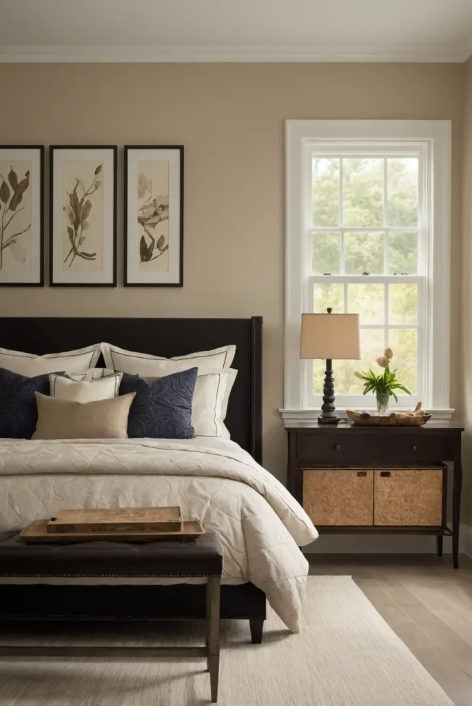
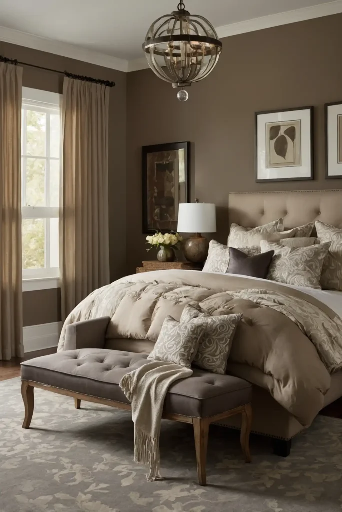
8: Warm Taupe
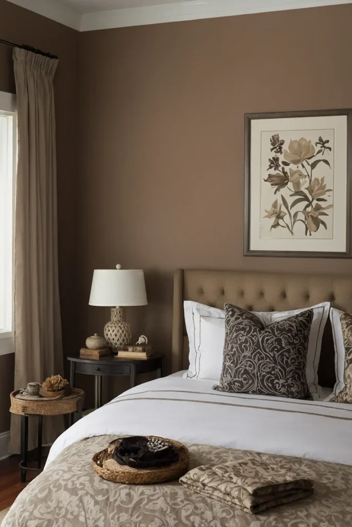
Warm taupe gives you sophisticated neutrality with subtle brown undertones that create instant coziness for guests.
This versatile color feels both elegant and approachable for universal appeal. It provides depth without being overwhelming or too personal.
You’ll find that taupe works beautifully with both warm and cool accent colors throughout different seasons.
The refined tone creates a timeless elegance that makes guests feel pampered while ensuring comfort across diverse style preferences.
9: Soft Lavender Gray

Lavender gray provides you with subtle color that promotes tranquility without being too feminine or bold for diverse guests.
This gentle hue creates spa-like serenity perfect for rest. It works beautifully with silver and white accents throughout the room.
You’ll love how this muted purple adds just enough personality while maintaining universal appeal.
The peaceful tone helps guests achieve deep, restful sleep while creating a memorable and calming environment they’ll appreciate.
10: Pearl White
Pearl white offers you luminous elegance with subtle depth that feels more interesting than stark white for sophisticated guests.
This refined neutral creates luxury without being pretentious. It provides perfect backdrop for elegant furnishings and artwork.
You’ll appreciate how pearl adds glamour while maintaining the clean, fresh feeling guests expect.
The sophisticated tone creates a high-end hotel atmosphere that makes visitors feel special while ensuring timeless appeal.
11: Gentle Eucalyptus
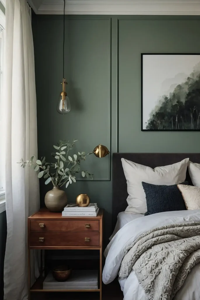
Gentle eucalyptus brings you spa-inspired serenity with subtle green tones that promote relaxation and wellness.
This soft color creates a refreshing retreat atmosphere for tired guests. It pairs wonderfully with white linens and natural materials.
You’ll love how eucalyptus evokes peaceful nature experiences while remaining sophisticated and contemporary.
The soothing shade helps guests feel rejuvenated while creating a memorable experience that combines comfort with subtle elegance.
12: Warm Linen
Warm linen gives you textural neutrality that feels both sophisticated and cozy for welcoming guest accommodations.
This gentle color creates comfort while maintaining elegant appeal. It provides warmth without being overwhelming.
You’ll find that linen works beautifully with layered textures and varied bedding styles throughout different seasons.
The inviting tone makes guests feel immediately comfortable while creating a refined atmosphere that reflects thoughtful hospitality.
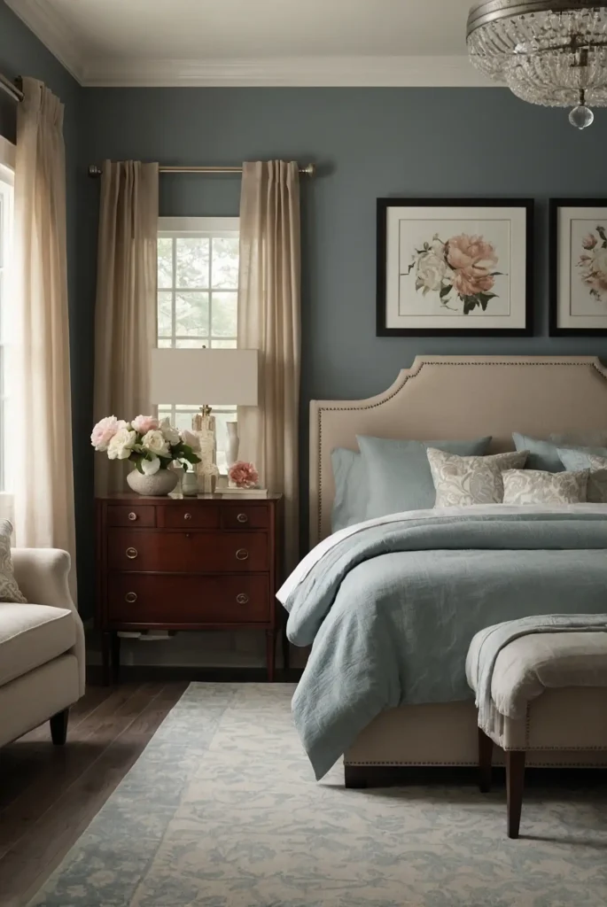
13: Soft Cloud Blue

Soft cloud blue provides you with gentle sky-inspired tranquility that promotes peaceful sleep and relaxation.
This light color creates airiness while maintaining warmth and welcome. It works beautifully with white and cream accents.
You’ll appreciate how pale blue evokes serene outdoor experiences that help guests unwind completely.
The calming shade creates a dreamy atmosphere perfect for rest while ensuring universal appeal across different guest preferences.
14: Gentle Oatmeal
Gentle oatmeal offers you warm neutrality with natural undertones that create instant comfort for visiting guests.
This soft color feels both cozy and sophisticated for universal appeal.
You’ll love how oatmeal provides warmth without being too bold or personal in color choice. It creates a perfect backdrop for varied decorating styles.
The comforting tone makes guests feel at home immediately while maintaining the elegance expected in well-appointed guest accommodations.
15: Whisper Gray
Whisper gray brings you subtle sophistication that feels both modern and timeless for contemporary guest appeal.
This gentle neutral creates calm without being cold or unwelcoming.
You’ll appreciate how whisper gray works with any accent color while maintaining serene atmosphere essential for rest. It feels fresh and clean consistently.
The peaceful tone promotes relaxation while providing elegant backdrop that makes guests feel valued and comfortable throughout their stay.
16: Pale Chamomile
Pale chamomile gives you gentle yellow tones that create warmth and cheerfulness without being overwhelming for guest comfort.
This soft color promotes happiness while maintaining sophistication. It works beautifully with white and natural textures.
You’ll find that chamomile adds subtle sunshine that brightens spirits while remaining universally appealing.
The uplifting shade creates a welcoming atmosphere that makes guests feel immediately comfortable and appreciated in your home.
17: Soft Driftwood
Soft driftwood provides you with natural neutrality that evokes peaceful beach memories for relaxing guest experiences.
This gentle color creates sophistication with coastal charm. It pairs wonderfully with white and blue accents.
You’ll love how driftwood adds subtle character while maintaining the calm atmosphere essential for restful sleep.
The serene tone helps guests feel transported to peaceful vacation memories while ensuring comfort and universal appeal.
18: Gentle Mist
Gentle mist offers you ethereal lightness that creates airy, peaceful atmosphere perfect for guest relaxation.
This subtle color promotes tranquility while maintaining elegant sophistication.
You’ll appreciate how mist adds depth without overwhelming the space or imposing personal taste preferences. It works with any decorating style beautifully.
The dreamy tone creates a floating, cloud-like feeling that helps guests achieve deep rest while feeling pampered and welcome.
19: Warm Stone

Warm stone brings you earthy elegance that feels both grounding and sophisticated for discerning guest preferences.
This neutral creates stability while maintaining contemporary appeal. It provides timeless sophistication.
You’ll find that stone gray works beautifully with both rustic and modern furnishing choices throughout different seasons.
The refined tone creates a boutique hotel feeling that makes guests feel special while ensuring comfort across diverse style preferences.
20: Soft Vanilla
Soft vanilla gives you creamy warmth that feels both cozy and elegant for welcoming guest accommodations.
This gentle neutral creates comfort without being overwhelming or too personal.
You’ll love how vanilla provides sweetness and warmth that makes guests feel immediately at home. It works with any bedding or accent colors.
The inviting tone creates a dessert-like comfort that promotes relaxation while maintaining the sophistication expected in guest spaces.
21: Pale Silver
Pale silver provides you with modern sophistication that feels both contemporary and timeless for elegant guest appeal.
This refined neutral creates glamour without being pretentious. It works beautifully with white and jewel-tone accents.
You’ll appreciate how silver adds subtle luxury while maintaining calming atmosphere essential for rest.
The sophisticated tone creates a high-end experience that makes guests feel valued while ensuring universal appeal across different preferences.
22: Gentle Sandstone
Gentle sandstone offers you desert-inspired warmth that creates cozy sophistication perfect for guest comfort.
This earthy neutral promotes relaxation while maintaining refined elegance. It pairs beautifully with cream and white.
You’ll love how sandstone evokes peaceful natural landscapes while remaining universally appealing to diverse tastes.
The grounding tone helps guests feel secure and comfortable while creating memorable atmosphere that reflects thoughtful hospitality and care.
23: Soft Moonbeam

Soft moonbeam brings you celestial lightness that creates dreamy, peaceful atmosphere ideal for restful guest sleep.
This gentle color promotes tranquility while adding subtle magic.
You’ll appreciate how moonbeam adds ethereal beauty while maintaining the calm environment guests need for relaxation. It works with any décor style.
The serene tone creates a floating, weightless feeling that helps guests achieve deep rest while feeling transported to peaceful dreams.
24: Warm Platinum
Warm platinum gives you metallic sophistication with subtle warmth that feels both luxurious and welcoming for guest comfort.
This refined neutral creates elegance without coldness. It provides timeless appeal.
You’ll find that platinum works beautifully with both bold and subtle accent colors throughout different decorating seasons.
The sophisticated tone creates a precious metal luxury that makes guests feel special while ensuring comfort and universal style appeal.
25: Gentle Bisque

Gentle bisque provides you with creamy sophistication that feels both elegant and approachable for diverse guest preferences.
This warm neutral creates instant comfort and welcome. It pairs wonderfully with gold and cream accents.
You’ll love how bisque adds richness while maintaining the peaceful atmosphere essential for quality rest.
The refined tone creates a luxurious yet comfortable environment that makes guests feel pampered while ensuring universal appeal.
26: Soft Cashmere
Soft cashmere offers you luxurious neutrality that feels both sophisticated and cozy for premium guest experiences.
This gentle color creates elegance while maintaining approachable warmth.
You’ll appreciate how cashmere evokes expensive, comfortable textures that make guests feel valued and special. It works with any decorating style beautifully.
The refined tone creates a high-end boutique feeling that ensures guests remember their stay fondly while feeling completely comfortable.
27: Pale Marble
Pale marble brings you sophisticated neutrality with subtle veining that creates elegant luxury perfect for discerning guests.
This refined color promotes serenity while adding visual interest. It pairs beautifully with white and silver.
You’ll love how marble gray adds depth and sophistication while maintaining calming atmosphere essential for rest.
The timeless tone creates a classic elegance that makes guests feel they’re staying in a luxury hotel while ensuring universal appeal.
Conclusion
Create a memorable guest experience with these welcoming colors that promote rest while reflecting your thoughtful hospitality and attention to comfort.