
27 Best Dining Room Paint Colors
Your dining room deserves a color that creates the perfect atmosphere for memorable meals and conversations.
The right paint choice transforms your space from ordinary to extraordinary. Whether you prefer timeless neutrals or bold statement hues, the perfect shade awaits.
These carefully curated colors will help you create a dining experience that reflects your personal style.
From warm and inviting tones to sophisticated dramatic shades, you’ll discover options for every design preference and lighting situation.
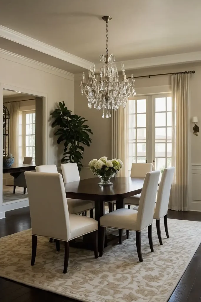
1: Classic White
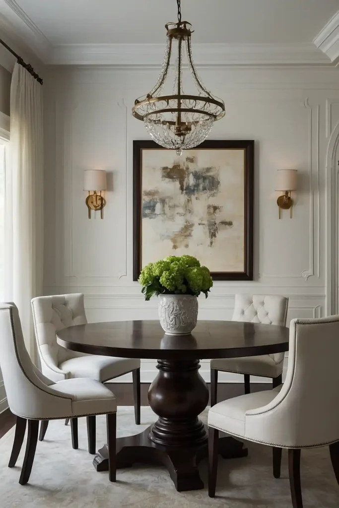
You can never go wrong with a crisp, clean white that brightens your dining space instantly.
This timeless choice creates an elegant backdrop for any décor style. White walls make your dining room feel larger and more open.
They also provide the perfect canvas for showcasing artwork, colorful table settings, and beautiful light fixtures.
The versatility of white allows you to change your dining room’s personality with accessories alone.
2: Soft Gray
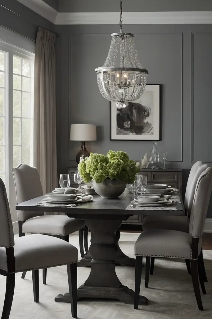
Gray offers you the perfect balance between warm and cool tones for sophisticated dining.
This neutral shade works beautifully with both modern and traditional furniture pieces.
You’ll appreciate how gray creates a calming atmosphere that encourages relaxed conversation. It pairs exceptionally well with white trim and colorful accent pieces.
This versatile color adapts to different lighting conditions throughout the day, maintaining its elegance from breakfast to dinner.
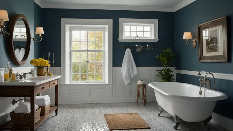
3: Navy Blue

Navy blue brings depth and drama to your dining room while remaining surprisingly versatile. This rich color creates an intimate setting perfect for evening entertaining.
You’ll love how navy serves as a stunning backdrop for gold or brass fixtures and warm wood furniture. It adds sophistication without overwhelming the space.
The deep blue tone works particularly well in dining rooms with plenty of natural light or strategic artificial lighting.
4: Sage Green
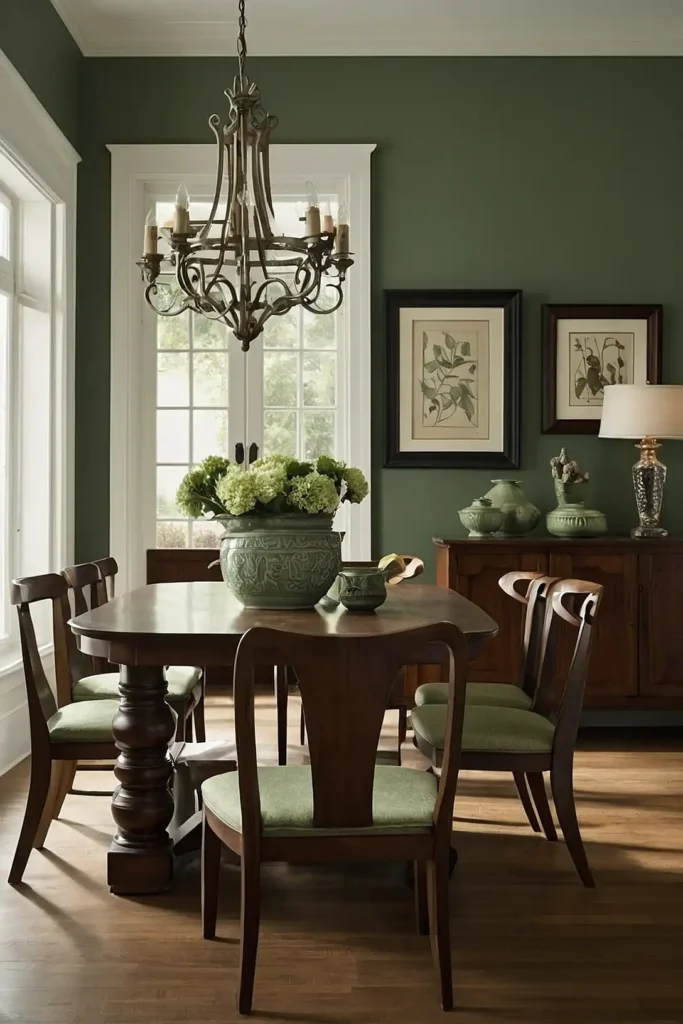
Sage green offers you a calming, nature-inspired hue that promotes relaxation during meals. This soft color creates a serene atmosphere that feels both fresh and timeless.
You’ll find that sage green pairs beautifully with natural wood tones and cream-colored accents. It brings the outdoors inside while maintaining elegance.
This gentle shade works well in both casual family dining areas and more formal entertaining spaces.
5: Warm Beige

Warm beige provides you with a cozy, inviting foundation that complements virtually any decorating style.
This neutral tone creates a comfortable environment for family gatherings.
You’ll appreciate how beige allows your furniture and artwork to take center stage. It works particularly well with rich wood tones and metallic accents.
The warmth of beige makes your dining room feel welcoming and encourages guests to linger over meals.
6: Deep Forest Green
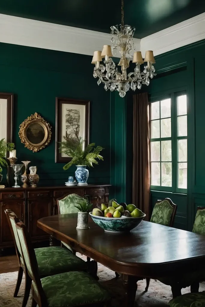
Forest green brings you the richness of nature with sophisticated elegance for formal dining.
This dramatic color creates a luxurious atmosphere reminiscent of high-end restaurants.
You’ll love how this deep green pairs with brass fixtures and rich wood furniture. It provides a stunning backdrop for fine china and crystal.
The color works especially well in dining rooms with architectural details like wainscoting or crown molding.
7: Charcoal Gray

Charcoal gray offers you a bold, contemporary choice that adds instant sophistication to your dining space.
This dramatic neutral creates a striking foundation for modern décor. It makes artwork and decorative pieces pop beautifully.
You’ll find that charcoal provides excellent contrast for white or light-colored furniture and accessories.
The deep gray tone works particularly well with metallic accents and contemporary lighting fixtures.
8: Cream

Cream gives you all the brightness of white with added warmth and softness for comfortable dining.
This gentle neutral creates an inviting atmosphere that feels both elegant and approachable.
You’ll appreciate how cream complements both cool and warm accent colors beautifully. It provides a perfect backdrop for seasonal decorating changes.
The subtle warmth of cream makes your dining room feel cozy without sacrificing sophistication or style.
9: Dusty Rose
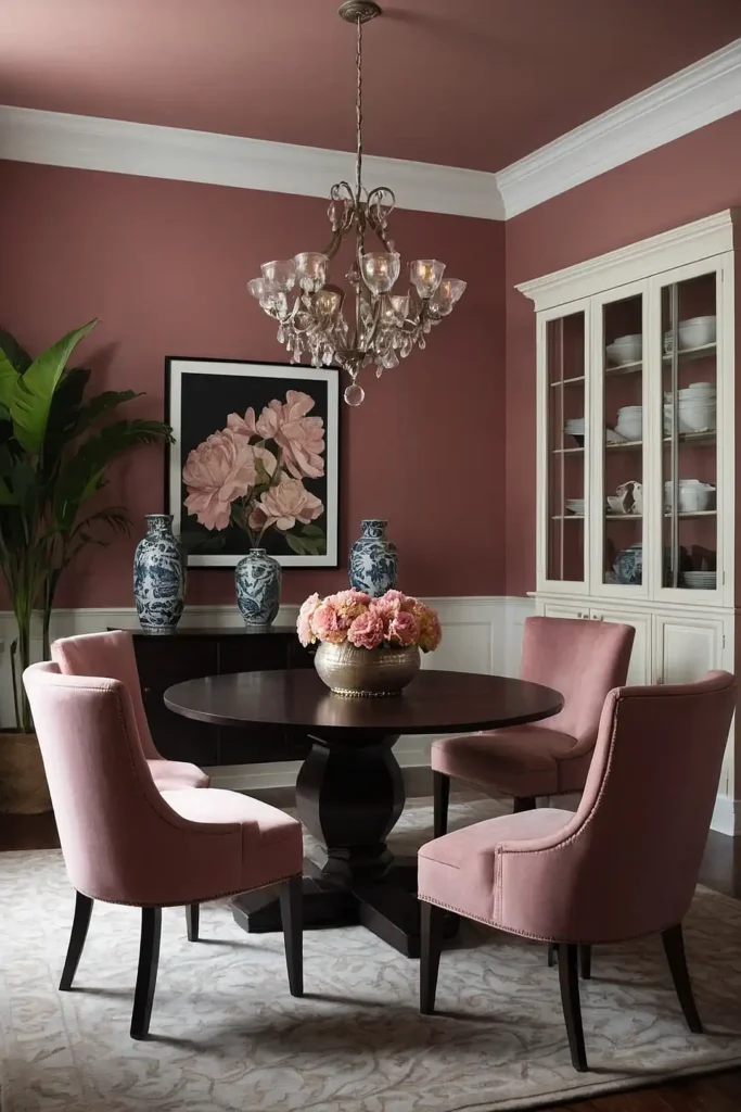
Dusty rose offers you a subtle pink tone that adds warmth and femininity to your dining space.
This sophisticated color creates a romantic atmosphere perfect for intimate dinners.
You’ll love how this muted pink pairs with gold accents and soft gray furnishings. It brings a gentle elegance that feels both modern and timeless.
The color works particularly well in dining rooms with plenty of natural light and vintage-inspired décor.
10: Rich Burgundy
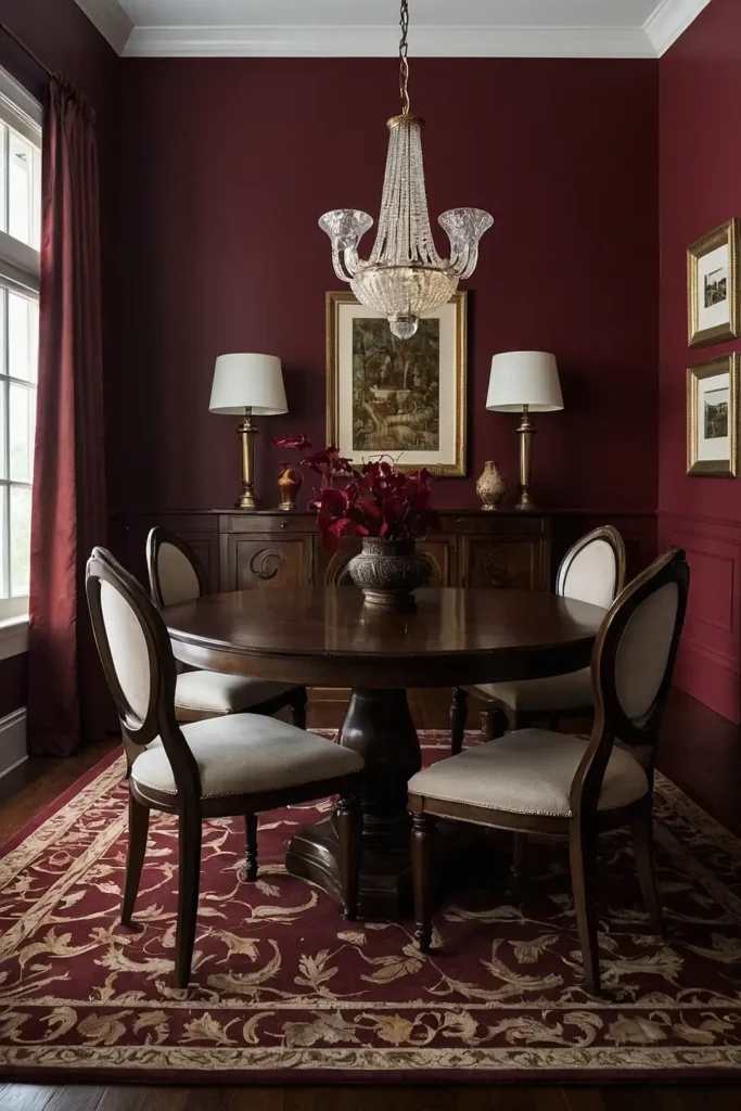
Burgundy provides you with a luxurious, wine-inspired hue that creates dramatic elegance in your dining room. This deep red establishes an intimate, sophisticated atmosphere.
You’ll appreciate how burgundy pairs beautifully with dark wood furniture and brass or gold accents. It creates a restaurant-quality ambiance at home.
The rich color works especially well in traditional or formal dining rooms with classic architectural features.
11: Terracotta
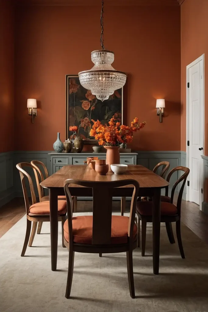
Terracotta brings you warmth and earthiness that creates a welcoming, Mediterranean-inspired dining atmosphere.
This orange-based neutral feels both cozy and sophisticated. It pairs wonderfully with cream, sage green, and deep blue accents.
You’ll love how terracotta complements natural materials like wood and stone beautifully.
The warm tone encourages relaxed conversation and creates a perfect setting for casual family meals and entertaining.
12: Classic Black
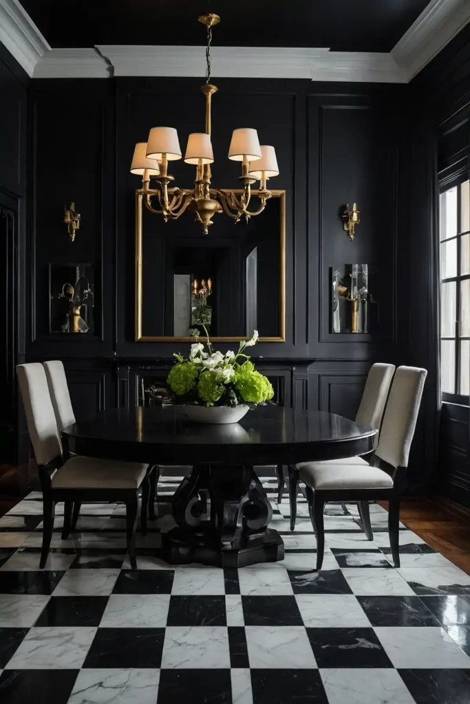
Black offers you ultimate drama and sophistication for a truly striking dining room statement.
This bold choice creates an elegant, restaurant-inspired atmosphere that impresses guests.
You’ll find that black makes metallic fixtures and colorful artwork absolutely pop with contrast. It provides a stunning backdrop for fine dining experiences.
The dramatic color works best in dining rooms with excellent lighting and lighter-colored furniture to balance the intensity.
13: Warm Taupe

Warm taupe gives you a perfect blend of brown and gray tones for versatile, sophisticated dining.
This neutral creates a calming atmosphere that encourages relaxed meals. It provides warmth without being overwhelming or too colorful.
You’ll appreciate how taupe works with virtually any accent color and decorating style.
The subtle tone allows you to experiment with bold accessories while maintaining a timeless, elegant foundation.
14: Soft Blue
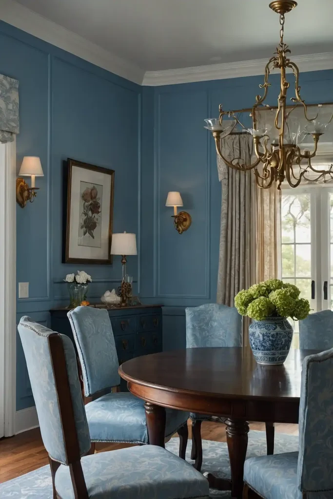
Soft blue brings you tranquility and freshness that creates a peaceful dining environment.
This gentle color promotes relaxation and enjoyable conversation during meals.
You’ll love how light blue pairs with white trim and natural wood accents beautifully. It creates a coastal or cottage-inspired atmosphere.
The calming tone works particularly well in casual dining areas and breakfast nooks where family gathers daily.
15: Deep Plum
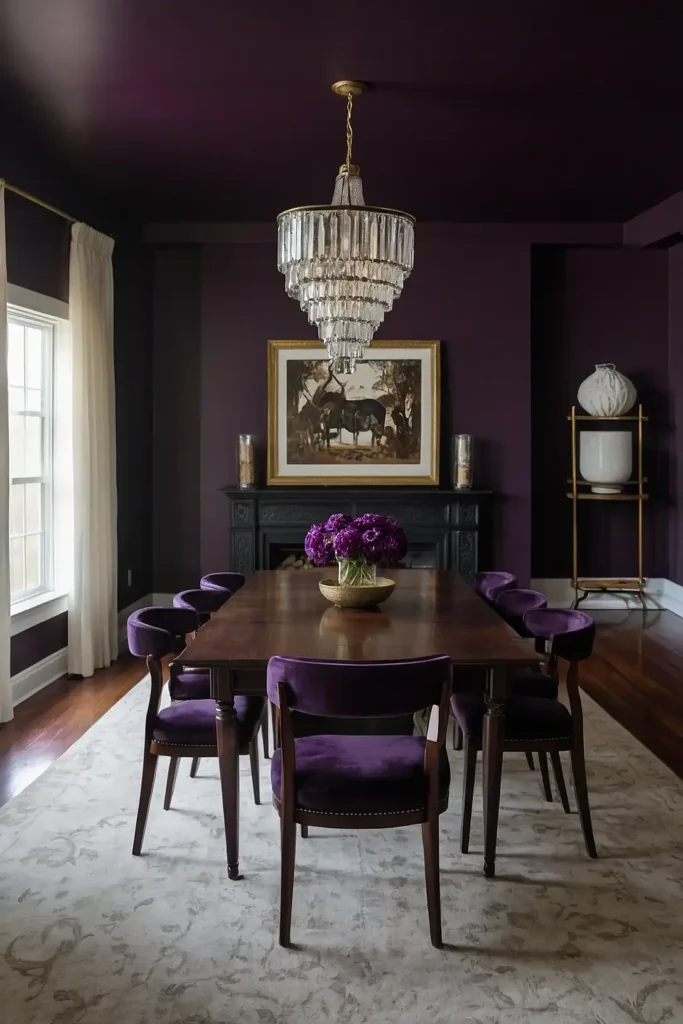
Deep plum offers you rich sophistication with a touch of unexpected drama for elegant dining. This purple-based color creates a luxurious, jewel-toned atmosphere.
You’ll appreciate how plum pairs beautifully with gold accents and dark wood furniture. It brings warmth while maintaining an air of mystery.
The rich color works especially well in formal dining rooms with traditional or eclectic decorating styles.
16: Blush Pink

Blush pink provides you with subtle warmth and femininity that creates a gentle, welcoming dining atmosphere. This soft color feels both modern and romantically timeless.
You’ll find that blush pairs beautifully with gold, brass, and natural wood tones. It adds softness without being overly sweet or childish.
The delicate tone works well in both casual and formal dining spaces, adapting to your decorating preferences.
17: Mushroom Gray

Mushroom gray gives you a sophisticated neutral with subtle brown undertones for cozy dining. This earthy color creates warmth while maintaining elegant simplicity.
You’ll love how this gray-brown blend complements both cool and warm accent colors perfectly. It provides versatility for changing seasonal décor.
The natural tone works particularly well with organic textures and materials like linen, wood, and stone.
18: Ivory
Ivory offers you the elegance of white with added depth and warmth for sophisticated dining.
This classic neutral creates a timeless atmosphere that never goes out of style.
You’ll appreciate how ivory provides a perfect backdrop for colorful artwork and table settings. It feels more approachable than stark white.
The creamy tone works beautifully in both traditional and contemporary dining rooms with any lighting conditions.
19: Olive Green

Olive green brings you earthy sophistication with a touch of Mediterranean charm for unique dining. This muted green creates a calming, nature-inspired atmosphere.
You’ll love how olive pairs with warm metals like brass and copper beautifully. It complements natural materials and vintage-inspired furnishings perfectly.
The sophisticated green works well in both casual and formal dining spaces, adding character without overwhelming.
20: Pale Yellow

Pale yellow provides you with sunshine and cheerfulness that creates an uplifting dining environment.
This gentle color promotes happiness and positive energy during meals.
You’ll appreciate how soft yellow pairs with white trim and natural wood accents. It brings warmth without being too bold or overwhelming.
The cheerful tone works particularly well in breakfast nooks and casual dining areas where families gather regularly.
21: Seafoam Green
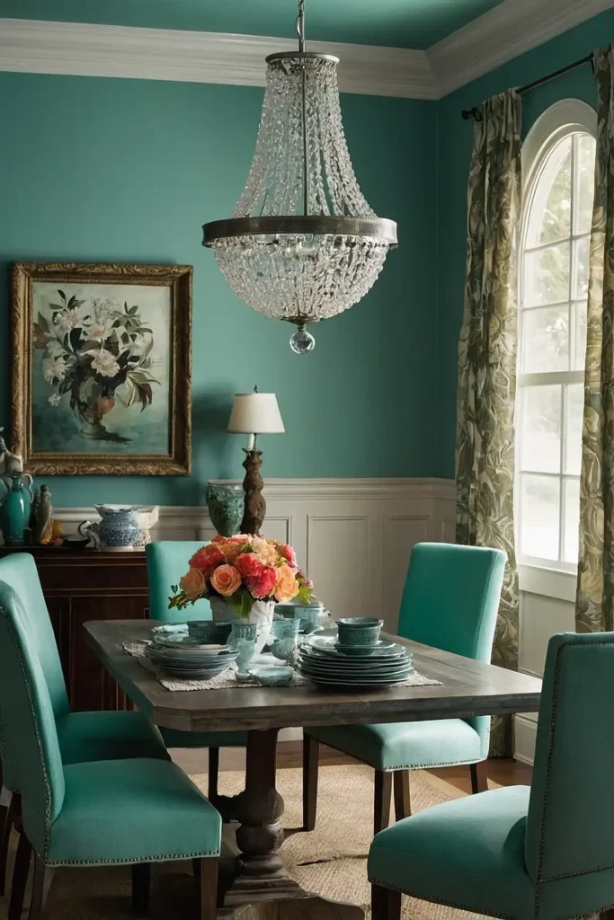
Seafoam green offers you coastal tranquility that creates a fresh, relaxing dining atmosphere. This blue-green blend brings the serenity of the ocean indoors.
You’ll love how seafoam pairs with white, cream, and natural wood tones beautifully. It creates a breezy, vacation-like feeling year-round.
The calming color works especially well in casual dining areas and spaces with plenty of natural light.
22: Camel
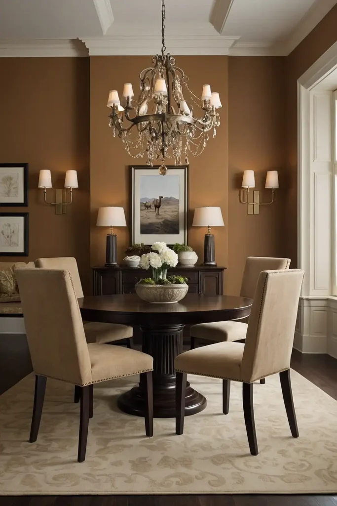
Camel brings you warm, desert-inspired sophistication that creates a cozy, luxurious dining atmosphere. This rich neutral feels both exotic and timeless.
You’ll appreciate how camel complements deep blues, forest greens, and metallic accents perfectly. It adds warmth without being too yellow or orange.
The sophisticated tone works well in both traditional and contemporary dining rooms with warm lighting.
23: Soft Lavender

Soft lavender gives you gentle sophistication with a touch of unexpected elegance for unique dining. This muted purple creates a calming, spa-like atmosphere.
You’ll find that lavender pairs beautifully with gray, cream, and silver accents. It brings subtle color without being overpowering or trendy.
The peaceful tone works particularly well in dining rooms used for quiet, intimate meals and relaxation.
24: Chocolate Brown

Chocolate brown offers you rich warmth and coziness that creates an intimate, welcoming dining environment.
This deep neutral establishes a sophisticated, earthy atmosphere.
You’ll love how brown pairs with cream, gold, and orange accents beautifully. It provides a perfect backdrop for warm, inviting gatherings.
The rich color works especially well in traditional or rustic dining rooms with natural materials and textures.
25: Soft Coral

Soft coral provides you with warmth and energy that creates a cheerful, inviting dining atmosphere. This peachy-pink blend feels both modern and timelessly elegant.
You’ll appreciate how coral complements gold, navy, and cream accents perfectly. It brings life to the space without being overwhelming.
The vibrant yet gentle tone works well in both casual and formal dining areas with good lighting.
26: Warm White

Warm white gives you all the benefits of classic white with added coziness for comfortable dining. This off-white creates brightness while feeling more approachable.
You’ll love how warm white works with any accent color and decorating style beautifully. It provides flexibility for changing your décor seasonally.
The inviting tone makes your dining room feel welcoming while maintaining the spacious feeling of traditional white.
27: Soft Mint
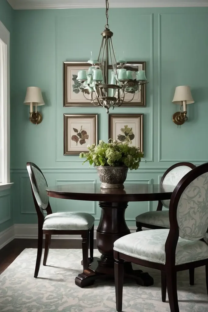
Soft mint brings you freshness and tranquility that creates a unique, calming dining atmosphere. This pale green feels both retro-inspired and refreshingly modern.
You’ll appreciate how mint pairs with pink, gold, and white accents beautifully. It adds subtle color while promoting relaxation during meals.
The gentle tone works particularly well in casual dining areas and breakfast nooks with vintage or eclectic décor.
Conclusion
Choose a color that reflects your personality and creates the dining atmosphere you’ve always wanted.
The perfect paint color transforms your space into a place where memories are made and shared.